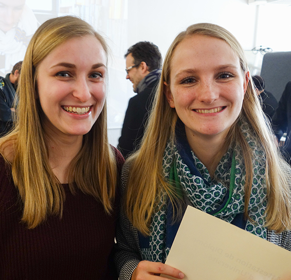
The aim of this end-of-study project, was to conclude my final year as Interaction design & Tangible interfaces Master’s degree. I was working with an engineer student, Clara Tersen, for this double diploma. We wanted to create a global experience including our different courses and skills in a functional prototype. Please discover our process:
Mingle // End-of-study project
01 // What subject?
Adam Simms, product designer for Trello, always says that a product is more efficient and optimised if its creators and designers use it. This is why we chose a context where we observed problems by ourselves: we decided to work on the particular context of solo traveling.
02 // Context study.
To better understand the context of solo traveling, we interviewed about 160 solo travelers. After what, we chose to do a deeper experiment with 3 travelers, traveling in really different ways (for work or hobby, long or short term, for the first time or not). We decided to lead regular interviews, to collect their impressions during their wandering trips.

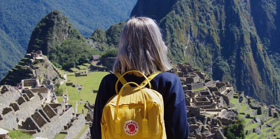
Jade, 25, was solo traveling for the first time, for a round-the-world trip.
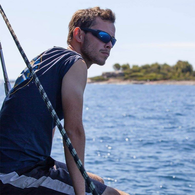
Antoine, 31, was a sailor, solo traveling on short-term during his boat stopovers.
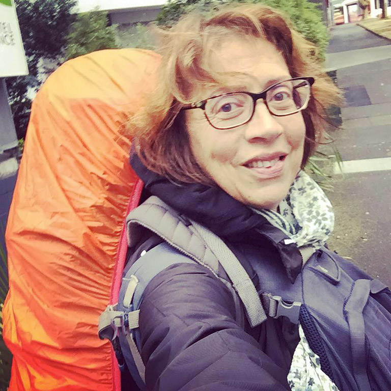
Catherine, 53, retired, was used to solo travel on long-term.
03 // Highlighting recurrent constraints.
The interviews were crossing on different points, symbolising where we could innovate and propose an improvement of the traveler’s experience.
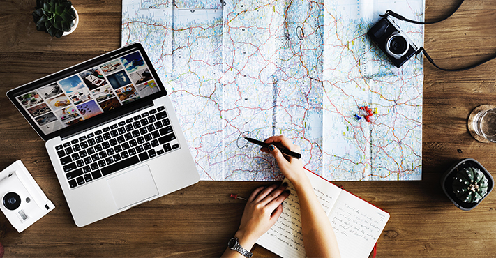
The first point was about tracing an itinerary: our travelers expressed the difficulty to define an order for the different steps, and to draw an entire route. They also told us about the complexity of being flexible, and to adapt in real time, depending on criteria such as events, weather, and transports.
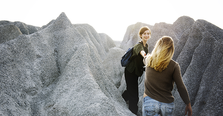
The second point was the difficulty of meeting people, like other solo travelers, during the trip. They highlighted many obstacles, such as the language, the safety, and the lack of opportunities. But they expressed that need of meeting people, to fight against the recurrent loneliness they perceive on long-term trips.
4 // Definition of our goal.
TO Enhance punctual meetings, over the steps of the wandering trip.

05 // Exploring the context thanks to specialists.
To better understand the issues of this context, we decided to turn to travel specialists of nowadays digital era.
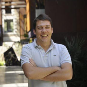
We had a nice discussion with Florian Dagron. He was the managing director of We like travel, a new kind of communication agency specialised in tourism on social media. He helped us understand nowadays tourism through services, social networks and data.
He taught us that Instagram is now used as a travel catalogue and diary for most of the young people, and this is why his clients (for example airlines) only communicate through social media. They use new ways of communication, like short videos, Instagram stories and so on, to promote their offers. We also had an overview of the issues working online: they need to use the good tags, to be found in the consistent research. They also need to be able to quickly adapt to innovations.
Then, Patrick Davin became tutor of our end-of-study project. He was webmaster for the travel agency Voyageurs du Monde. He explained us how nowadays travel agencies work, how they are able to propose consistent travel recommendations thanks to online algorithms. He helped us understand how to organise data and tags in background of our service.
My colleague Clara worked on this technical part. I was glad to discover the process with her: it was a way to learn what are the data needed, and what are the possibilities using it.
06 // Defining the main actors of our context.
Our service is created for travelers, but they are many other interesting actors in the context of tourism.
We highlighted three main actors, who could benefit from our service, and be useful for the collection of data and information.
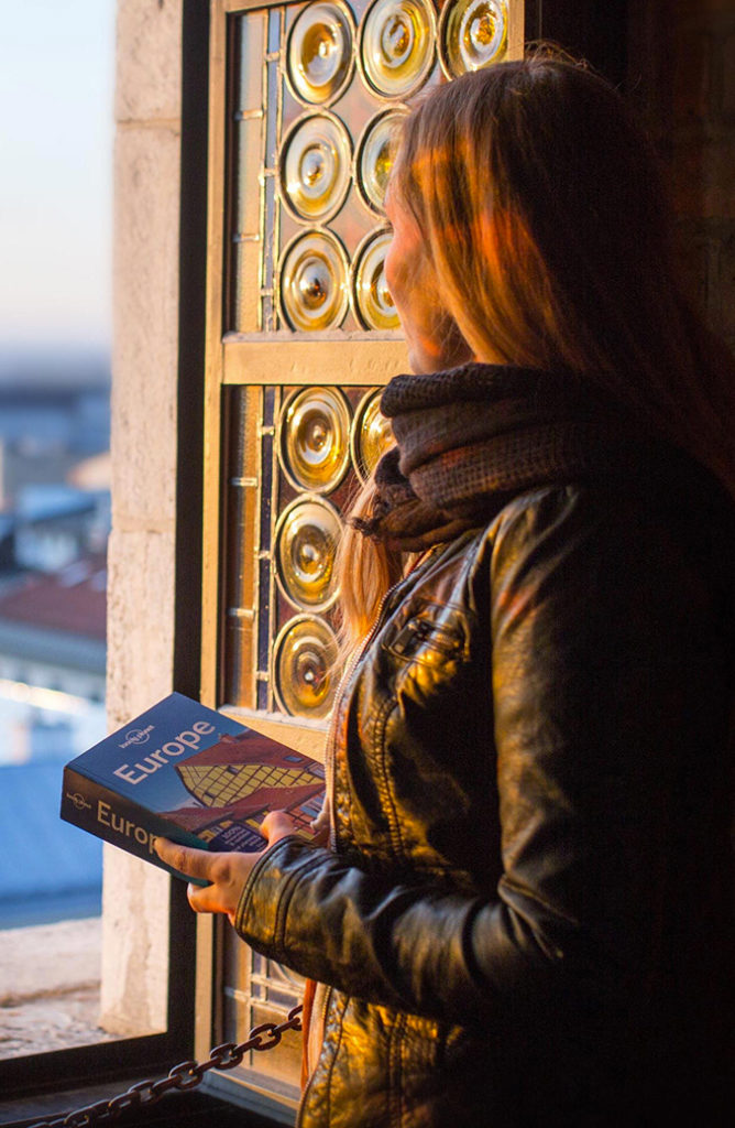
Editors of guide books have knowledge to share about destinations, travel tips and so on. Today most of them are still printing paper books, and need to modernise their medium. It would be a way to target new people: for example young people using smartphones as their main source of information, or long-term travelers who can’t carry many books.

Bloggers have other tips to share about their personal experience, such as travel scheduling, packing, or technologies to use, ways to communicate etc. They have some personal advices to give on destinations and places to visit, that are pretty different from editor’s. Bloggers need to make theirselves known, and to win reader’s loyalty. Sharing their articles through a service could be a way to build a reputation.
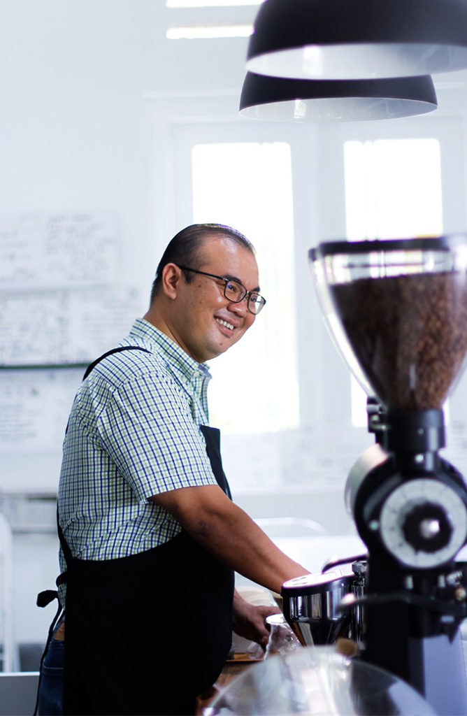
Shopkeepers are also part of the tourism process, because they need to deal with the tourist flow. Unlike the two previous actors, they have few information to share, but can learn a lot from the data expressed from tourists. They can adapt to the flow, and feedbacks from visitors. Also, they can build a reputation thanks to tourists advices and recommendations.
07 // Defining our concept.
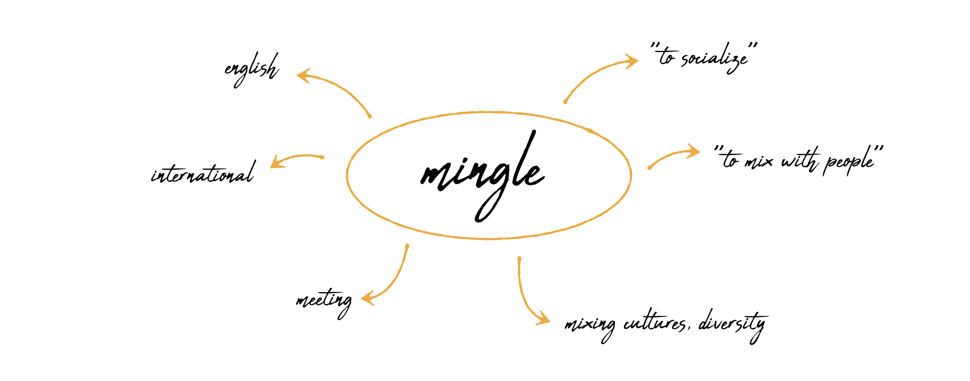
We decided to create a service called Mingle: an english and international term symbolising the socialisation, the meeting, the road crossing of travelers. Mingle means “to socialize” as well as “to mix with people”, representing a will of diversity, and a mix of cultures.
08 // Defining a first scenario.
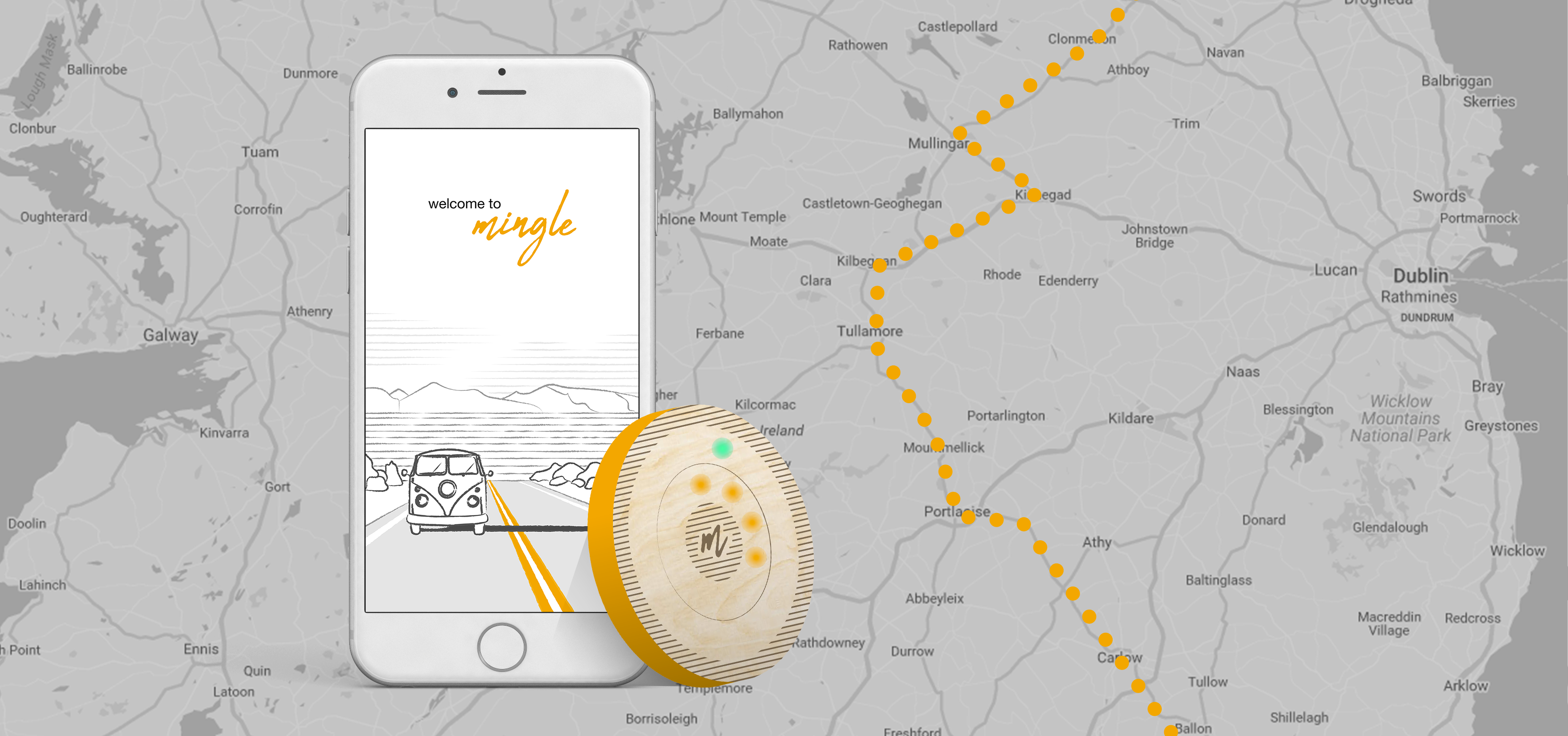
Our service is a mobile app linked to a connected object. At this point, the shape is still to define, but we created a draft scenario to get a first customer path.
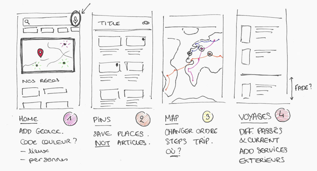
The user selects several steps for its wandering trip. The steps can be on different levels (cities, places to visit, monuments…). We will say that he/she defines “pins” on the map.
When the user enters in a defined perimeter, close to one of the pins, the connected object reacts: it sends a signal, giving a direction to follow.
The indicated direction can lead to two options: either to a monument/place to visit, or to a fellow traveler to meet!

09 // Sketching wireframes.
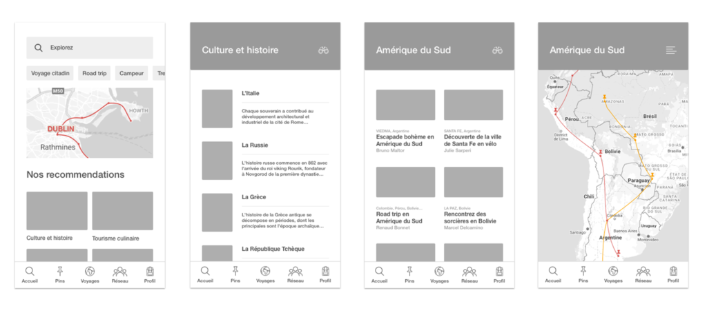
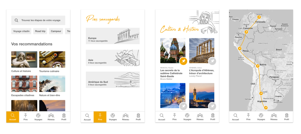
We had to define how to represent different level of informations, how to draw a recommended itinerary and how to classify pins.
10 // Moodboard and inspirations.
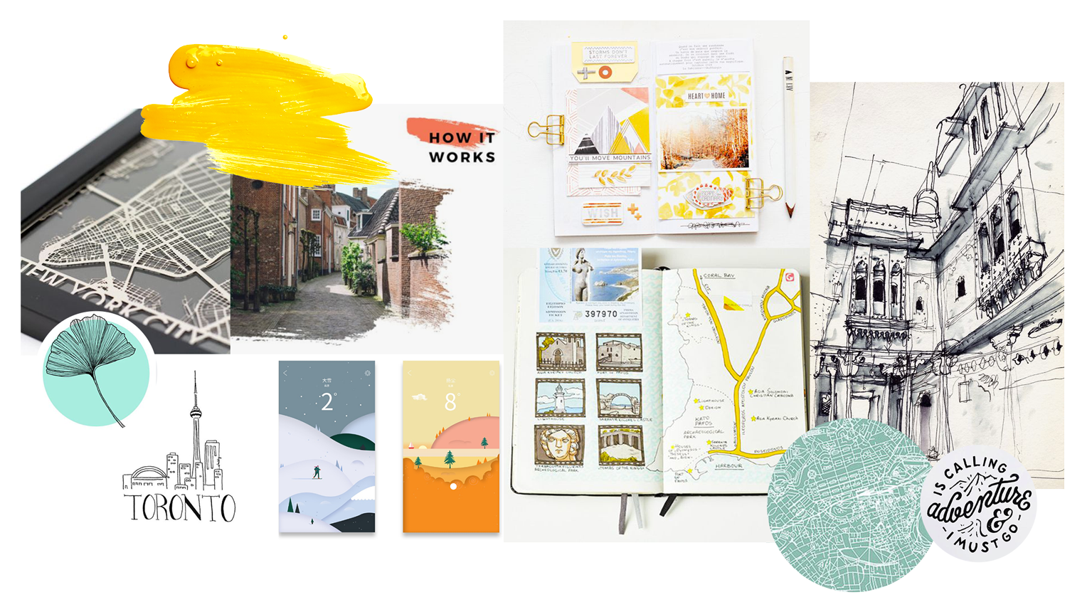
While the shape of our service was on its way of definition, we had to think about a proper graphic universe. We took inspiration from travel journals that are full of sketches, pictures, handwritten notes. We wanted to give a both spontaneous and organised look to our service.
11 // Sketching the connected object.
We had to understand what are the electronic material needed, to be able to draw a consistent shape. We kept in mind the context of our travelers, that mostly travel alone, with only a backpack. This was our main constraint: the object had to adapt to their way of traveling, to their current equipment. The object had to be light, adaptative, or easy to carry.In some places of the world, using an expensive smartphone in the street is not recommended (for safety), that is what we learnt from previous interviews. So we decided to add sensors to our connected object, so that the user can interact with our service through it, without having to take a smartphone out.
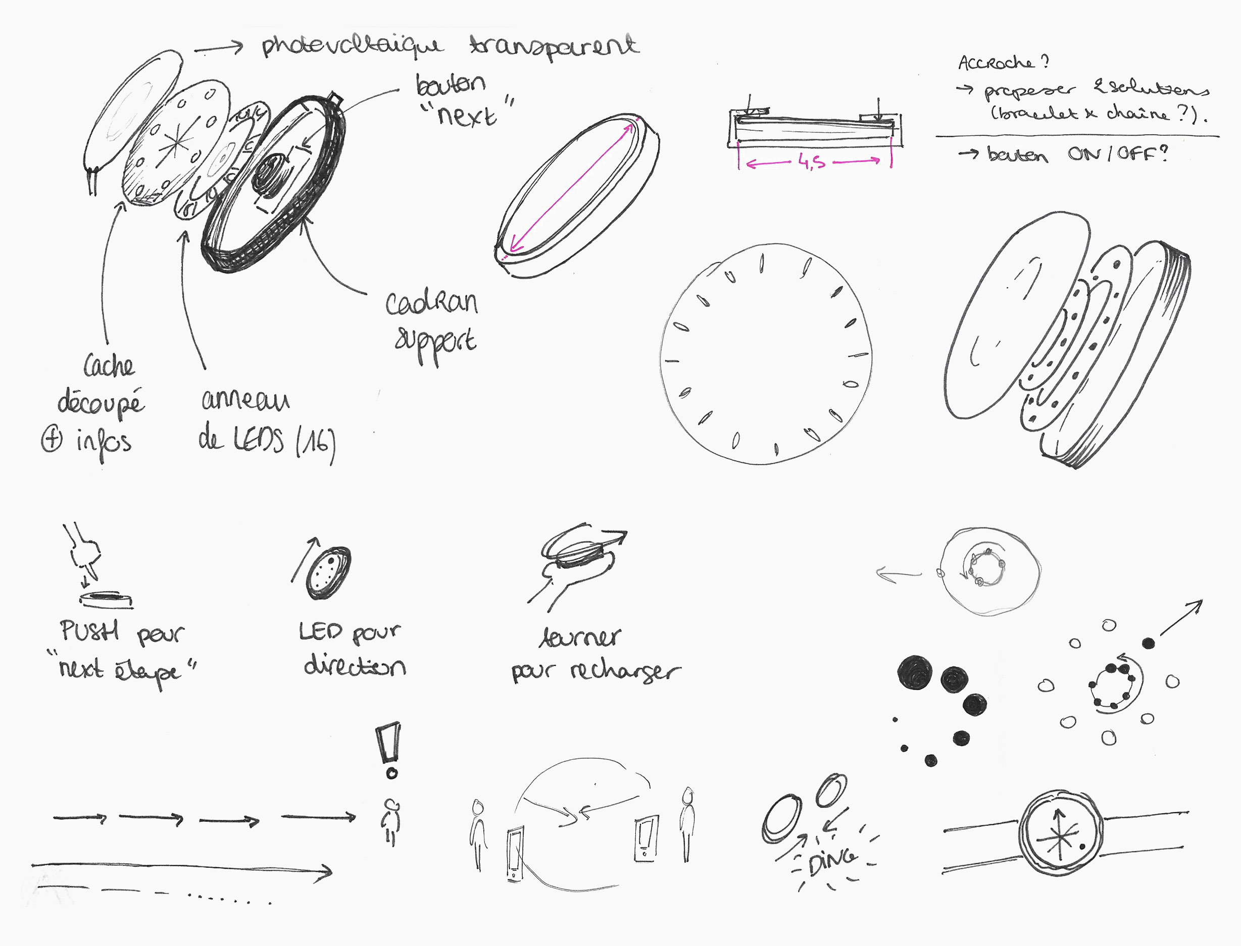
The compass is part of the travelers symbols: it is a precious and useful object, indicating cardinal points. For centuries, it was the tool travelers used to travel and to follow directions. This is why our first sketches are inspired by the compass. We made it evolve through 3D models, to make sure all electronic components will fit in. Then, we defined a final design with colours and textures related to our visual identity.
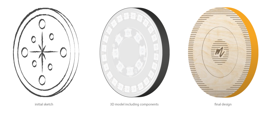
12 // Mingle was born!
This is how we came up with this first version of Mingle.
13 // Definition of our connected object.
We decided to propose an object that could be worn on the wrist, thank to a bracelet: it would be easily accessible and the given information would be readable in any context. Also, its location on the body offers the possibility to interact with it through arms movements, which makes it spontaneous and easy.
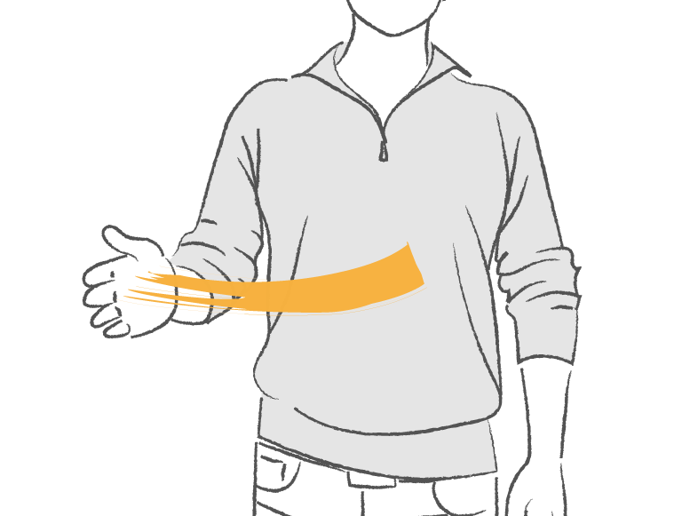
A physical “swipe”, using the arm, going from the front to the right, will reject the destination proposed on the connected object, and will lead to the next step.
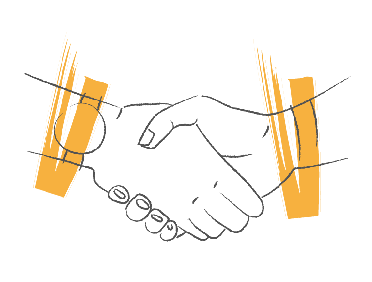
Shaking hands, with both connected objects on wrists, will send the signal to the smartphone and validate the meeting of another solo traveler.
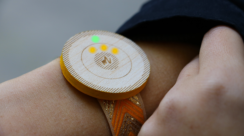
The information is expressed on the connected object through LEDS: the orange ones give the estimated moving time (pre-defined on the app, as one led = 5 minutes walking). The green light give the precise direction to follow, and evolves during the walk.
14 // Highlighting ethical values.
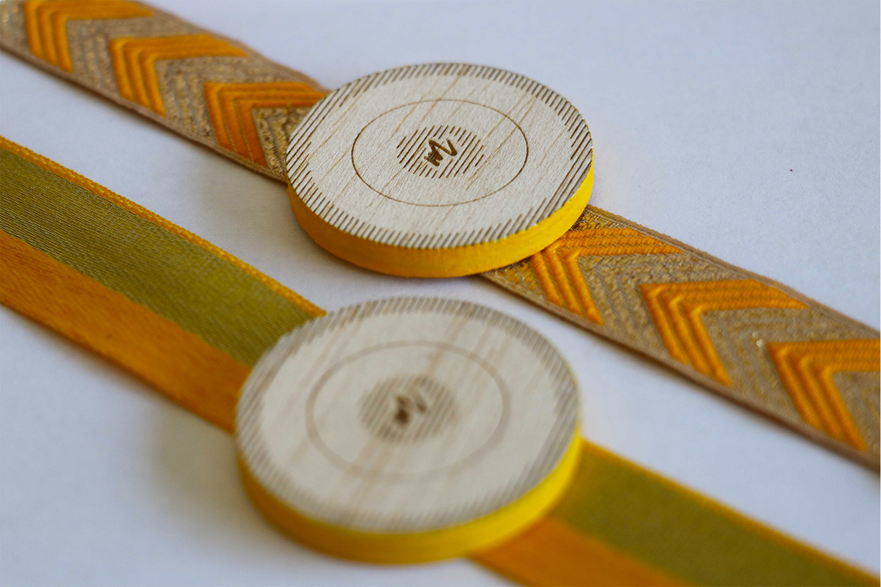
It was important for us to create a service aligned with travelers values, which are the respect of nature and the support of a fair trade. This is why we first chose to have a low-tech object, using a few electronic components. We created a discreet object made of wood, that shows no value. The wood used to create the object comes from offcuts, and the bracelet is hand-braided with eco-responsible fabric. And to give our users an opportunity to act for nature, we decided that a tree will be planted for each meeting.
15 // Demonstration video.
Please discover our demonstration video, which gives a good overview of the whole project, in a complete scenario.
16 // What's next?
Clara and I got our double diploma with this project, on both engineer and design sides. We both really enjoyed working together: we learned a lot about each other’s fields, but also about project management, and how to complete each other’s work as a team. We had no difficulties working together, and had an easy communication which made it fluent and enjoyable. We still believe that our service could be useful for solo travelers, and hope to get an opportunity to lead it to a concrete realisation in the future.
After this project, Clara did an internship as data engineer at Hachette editors, in Paris. I flew to Malmö, Sweden, and did my internship as UI/UX designer at ustwo.
Thank you for reading about our project. Do not hesitate to contact us if you would like to talk about it. We would be glad to exchange about our work.
